
The Influence of Colours | Commercial Space Design
When we think about the design of a commercial space, it is common to associate colours purely with aesthetics. However, their influence goes far beyond decoration. Colours are a powerful tool for visual communication, capable of influencing emotions, behaviours, and even how consumers perceive a space and the products displayed within it.
In the area of Design + Architecture, the choice of colours is one of the most important strategic elements in project development. A well-considered chromatic combination can make a space more welcoming, increase the sense of spaciousness, reinforce brand identity, and create a more pleasant shopping experience.
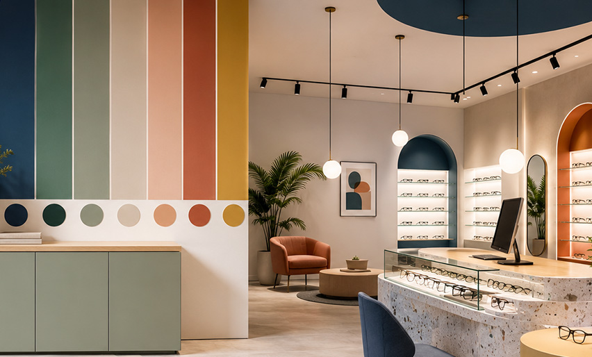
Cool colours, such as blues and greens, convey tranquility, confidence and comfort, and are often used in spaces where the consumer needs more time to make decisions. Warm colours, such as red, orange and yellow, attract attention, energy and dynamism, making them excellent allies for highlighting products, campaigns or specific areas of the shop.
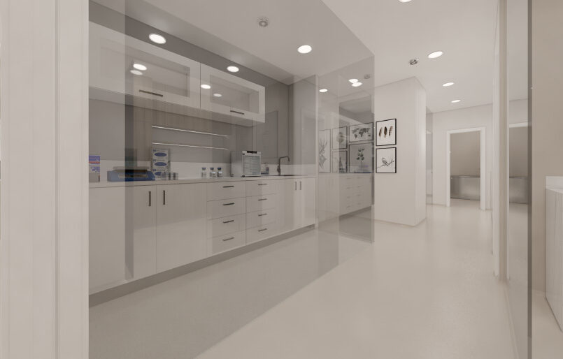
Beyond the emotional component, colours also influence the perception of space. Light tones help to visually enlarge environments, while darker colours create depth, sophistication, and more intimate settings. The correct use of these contrasts allows for the creation of visual pathways, highlighting strategic areas and improving the circulation experience within the space.
In retail, each colour communicates a message. Red is associated with energy and action, blue with trust and professionalism, green with balance and well-being, while neutral tones convey elegance and timelessness. When applied consistently with the brand's identity, colours become an essential tool for strengthening positioning and creating an emotional connection with the consumer.
In space design, colours don’t just serve to decorate – they serve to communicate, influence and create memorable experiences.